Chart Tag Reference
The Chart Tag allows you to visually present the data stored in your data source in a variety of formats. Charts are a necessary and effective way for representing numerical data. The Chart Tag lets you create a variety of charts: column, bar, line, pie, scatter, doughnut and bubble.
The look of charts are highly customizable. You can include a title, create labels and axis titles, choose colors, include legends, format text and other objects, and add other options. Report Designer works with native Microsoft Office charts allowing you to use features available for customizing and presenting your data in a tool with which you are already familiar. Also, Report Designer's data selection wizards are available to make creating your chart easier.
This article describes the Chart Tag Editor, which is a Chart-Tag-specific version of the standard Report Designer Tag Editor. Although the Chart Tag Editor shares many features with the standard Tag Editor, there are many chart-specific features in the Chart Tag Editor not covered in the Tag Editor Reference.
For a detailed discussion about what Report Designer charts are, including definitions and terminology, see [All About Charts]. For more information about using the Chart Tag Editor to create charts, see How Do I Use a Chart Tag?. See Chart Tag Limitations for limitations of using Report Designer and Word charts in your Report Templates.
Accessing the Chat Tag Editor
Select a Chart Tag in your Report Template, and a new Edit Chart Data button appears in the AutoTag ribbon. Click on the Edit Chart Data button to bring up the Chart Tag Editor on the selected Chart Tag:

The Chart Tag Editor Interface
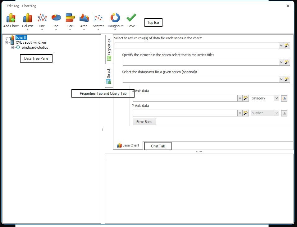
The Chart Tag Editor has six main sections:
- Top Bar
- Data Tree Pane
- Properties Tab
- Select Tab
- Chart Tab
- Results Pane
Top Bar
The Top Bar is used to select the type of chart you wish to display in your output. Click on a chart-type button such as "Pie", then select a chart type.
Do not use MS Office's Chart Tools to select a chart type! It can adversely affect the output of your chart.
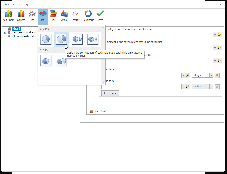
The Add Chart button is used to overlay your original chart with an additional chart, i.e. adding a line chart to a column chart.
Data Tree Pane
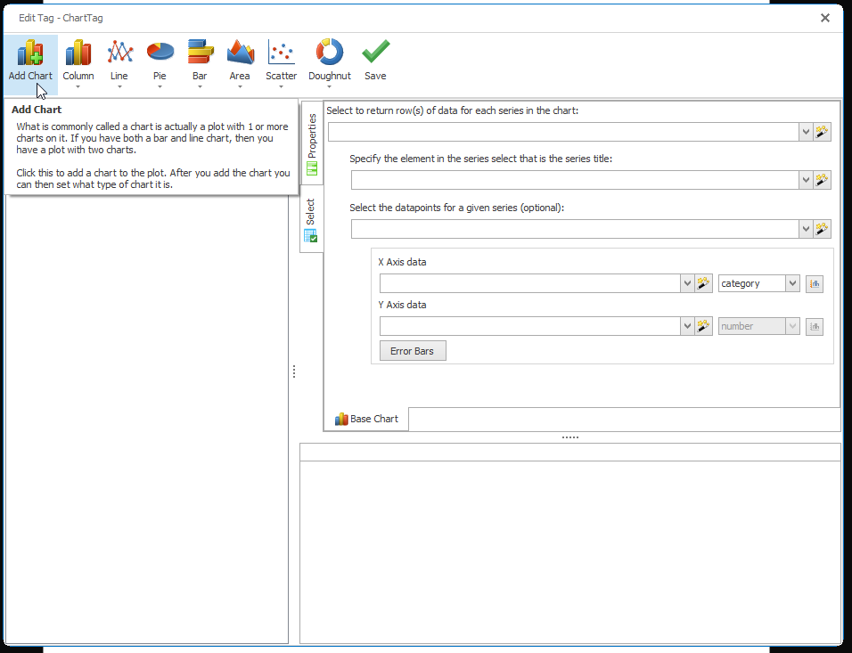
Use the Data Tree Pane to expand, collapse, and view the nodes of your connected data source. You can assign a node to your Tag by dragging the node from the Data Tree Pane and dropping it into any of the query fields in the Query Pane.
Properties Tab
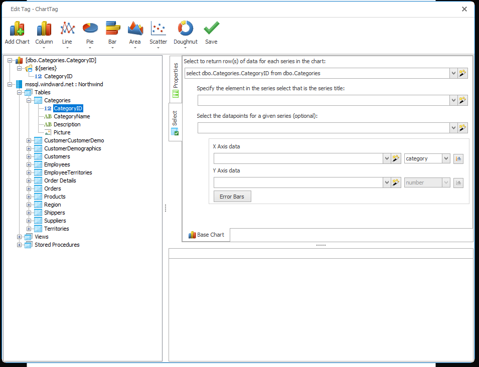
Here we see the properties of a Chart Tag. Below, each property is described in detail. Unless otherwise noted, each property is required.
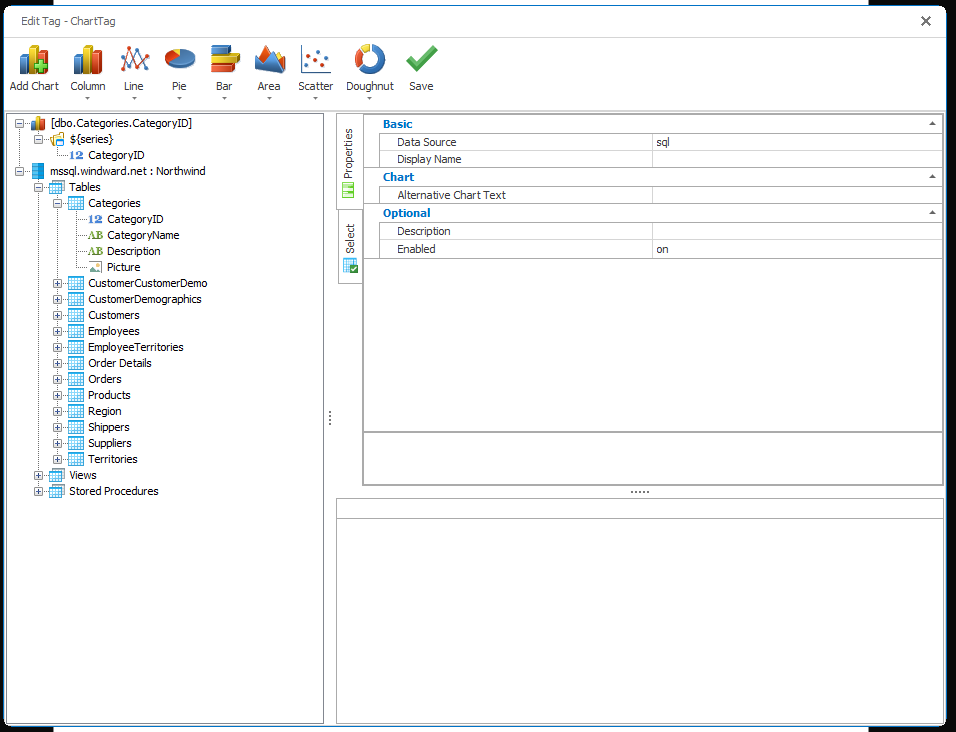
description (optional)
A brief description of this Tag.
enabled (default: on)
Controls whether a Tag is executed when generating output. This can be useful when debugging a template.
- on - this Tag will be executed when output is generated
- off - this Tag will not be executed when output is generated
- engine-only - this Tag will be executed only if output is generated using one of the Report Engines
- autotag-only - this Tag will be executed only if output is generated using the Report Designer
nickname (optional)
Not applicable to Chart Tags
Select Tab
In the Select Tab there are five fields that hold queries specifying the data to chart. Note each field has a Select Wizard button that can be used to bring up the appropriate Select Wizard to create a query.
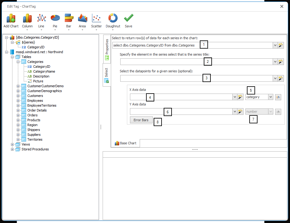
- This field is the primary query which returns the data to be displayed against the X and Y axes, and can be refined by other queries in the Select Tab. The rows or nodes returned by the query can be referred to with the variable
${series}. To refer to a SQL column, use${series.<columnName>}. To refer to an XML node, use${series.<childNodeName>}or${series}/<path>/<nodeName>. - This field selects a series name. One series will be created for each unique series name selected. If a series name is encountered multiple times, the associated plot points are merged into a single series. If unspecified, all plot points will be merged into a single, unnamed series.
- This is an optional, secondary query, typically used when XML plot points are grouped by series. It functions the same way as the primary query, but the series name is selected directly from the primary query, then the coordinates are selected from this query. The data returned by this query can be referred to in other queries as ${data}.
- This query selects the plot point X axis values. You can create this query by dragging and dropping from the primary query.
- Use this menu to select the type of data in your data source for #4 above. Report Designer will guess the type, but it is better to manually set the type of data. Next to the menu is a button you can use to switch the X axis from the bottom to the top of the chart.
- This query selects the plot point Y axis values. You can create this query by dragging and dropping from the primary query.
- Use this menu to select the type of data in your data source for #6 above. Report Designer will guess the type, but it is better to manually set the type of data. Next to the menu is a button you can use to switch the Y axis from the left to the right side of the chart.
- Use the Error Bars button to display margins of error for your data points. Queries or absolute values can be used to specify the range (plus/minus) of the error bars.
Chart Tab
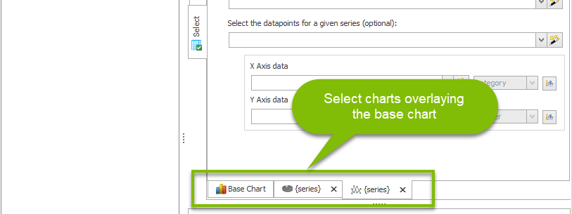
Use the Chart Tab to select the Select Tab for additional graphs you've added to the base graph.
Results Pane
The Results Pane shows the results of your queries, and updates in real time as you change your queries.
